How I Built a Canva + After Effects Hybrid With Replit
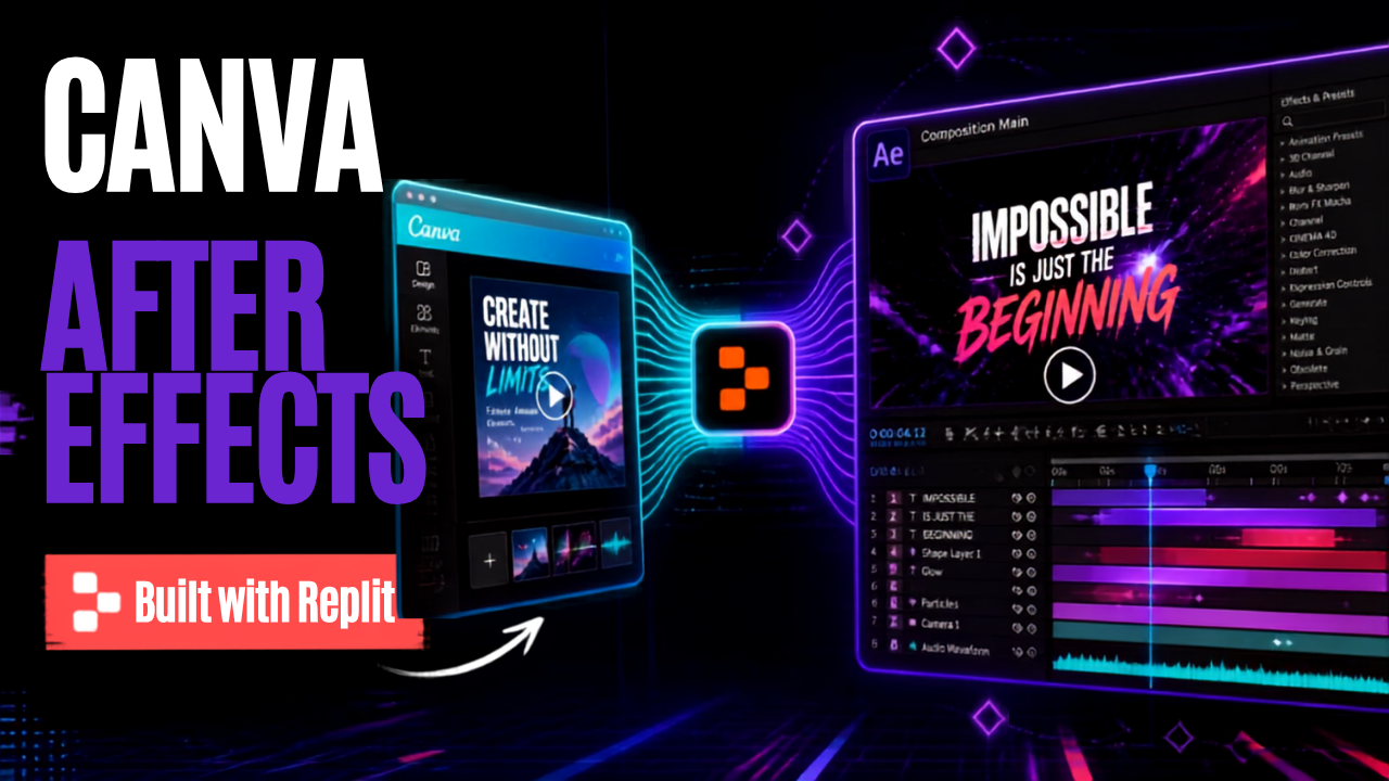
How I Built a Canva + After Effects Hybrid With Replit
Introduction
I didn't set out to build a Canva competitor. I just wanted a faster way to turn blog posts into social carousels. But somewhere along the way, the tool I was building with Replit — Carousel Studio — started doing things neither Canva nor After Effects quite does on its own. Not because I was chasing feature parity with either one, but because I kept running into the same wall: capture the 20% of After Effects that social creators actually use, skip the other 80%, and make it approachable in five minutes instead of five hours.
That reframing — 20% of the power, none of the learning curve — turned out to be the whole thesis of the app.
Where Canva Fell Apart For Me
Canva's pitch is variety: thousands of templates, always something new. In practice, that variety worked against me. I'd open it needing one carousel and end up twenty minutes deep in a template browser, scrolling past the same handful of generic corporate looks — clean sans-serif, soft gradients, stock-photo energy — none of which matched what I actually wanted.
My taste isn't corporate. I wanted synthwave grids, cyberpunk neon, Matrix-green terminal aesthetics — a very specific visual language, not "professional and safe." Canva's template library just doesn't go there. And when I tried leaning on Canva's built-in AI to generate the artwork myself, it didn't get me there either — the results were competent and completely generic, nothing close to the mood I was after.
Carousel Studio's themes sidestep that problem entirely rather than trying to out-generate Canva's AI: the synthwave, cyberpunk, and terminal aesthetics are hand-authored — their own chrome, typography, and layouts, built as design systems rather than prompted image by image. No generative model in the loop to produce something "close enough."
The deeper problem wasn't the templates, it was the model. Canva optimizes for variety, and variety actively fights consistency. Even Brand Kits never really clicked for me — I spent more time hunting for a template that fit than actually designing anything. So Carousel Studio was built around a different, deliberately narrower idea: two independent things — a Brand Kit (the look: colors, fonts, logo) and a Template (the structure: which slides, in what order, for what purpose) — that combine instead of competing. Pick a purpose, pick a brand, done. No hunting.
Borrowing From After Effects Minus the Bloat
Once the visual identity problem was solved, the next gap was motion. Static carousels are fine, but Instagram increasingly rewards Reels and Stories — and that meant bringing in ideas that normally live in After Effects: keyframed animation, staggered text entrances, real transitions instead of a plain crossfade.
The trap here is obvious: After Effects is enormously powerful and enormously not-five-minutes. Most of what it does — a full multi-track audio timeline, 3D camera work, particle physics, an expressions scripting language — is exactly what a social creator never touches. So the rule I set for Carousel Studio was strict: borrow the small slice that actually gets used — entrance animations, transitions, timing — and leave the rest out entirely. No camera rig, no compositing stack, no scripting language to learn. Just the part of motion design that makes a carousel feel alive instead of static.
The Branded Transitions
A deck still exports the way you'd expect — pixel-perfect PNGs for a static carousel post, or the whole thing stitched into one MP4 reel when you want motion. The transitions live in that second path.
The clearest proof of that idea in action is the transition system. Instead of a plain crossfade between slides, Carousel Studio can play a full-frame wipe — thick, rounded bars sweeping diagonally across the cut, covering the frame, then clearing it on the way out. It works at every export speed and across every deck format (square, portrait, story), and it reads as an actual motion-design choice, not a slideshow default.
Bar Convoy, the original version, pulls its bar colors straight from the deck's own theme — so a cyberpunk deck gets a cyberpunk wipe, and a warm sunset deck gets a warm sunset wipe, automatically.
Built with Replit is the same motion, re-skinned — Replit's own orange, ink, and cream, with the platform's mark riding through the convoy. A small thing, but it's a nice full-circle touch: the tool that got built on Replit can quietly say so, mid-transition, in its own visual language.
Neither of these needed a video editor to produce. They're generated the same way the rest of the deck is — describe what you want, iterate on it, ship it.
Export the Transition Into Your Own Video Editor
The transitions turned out to be useful beyond Carousel Studio itself. If you've ever paid for a transition pack on a stock-footage marketplace, or hired someone on Fiverr for a five-second wipe, you already know that market exists — and it's solving a problem I now have the tools to solve for myself.
So Carousel Studio can export a transition as a standalone asset pack — alpha-transparent video you can drop directly into your own footage in DaVinci Resolve, ready to sit over any clip you're editing, with no dependency on the carousel it came from. It turns motion design that would otherwise be locked inside one app into something portable — usable in a completely different editing workflow.
I'm keeping the details of how that export actually works close to the chest for now — there's more happening under the hood than I want to unpack here — but it's a feature substantial enough that it deserves its own post. Same goes for the six theme-specific "signature" transitions I haven't even shown you yet, each one hand-built to match its theme rather than being a generic effect with different colors slapped on. Both are coming in follow-up posts.
How It Actually Gets Built
None of this came from a spec written up front. The pattern that's worked, over and over, is: ship a small version of a feature, actually use it on real content (dogfooding as they say) , and see what breaks or feels wrong before building the next thing. Several of the app's best details — the theme-native transitions, the branded wipe, the way exports handle awkward edge cases — came out of that loop rather than out of planning.
The one rule that doesn't bend: static exports never change. Whatever animation or motion gets added to the live editor or the video export, a plain image export of a slide has to come out exactly the same as it always has. That constraint has made the whole thing feel much safer to keep building on — new motion is additive, never something that quietly breaks an old deck.
What's Still Ahead
There's more of After Effects still worth borrowing, carefully: a real keyframe timeline per slide, text that animates in word-by-word instead of all at once, a proper brand kit that remembers a look across projects instead of resetting each time. All parked, all deliberate — the same discipline that kept the current feature set from turning into feature bloat.
For now, the thing I keep coming back to is this: I didn't need a design team or a motion-graphics specialist to get here. I needed a clear idea of what I actually wanted, a willingness to describe it, test it, and refine it — and Replit to build it with me. That's a very different kind of "hybrid app" than I expected to end up with.
Watch the Full Demo
Everything above — the Brand Kit and Template model, the branded transitions, the whole train of thought — is easier to see than to describe. I recorded the full process on my YouTube channel: picking a brand and template, building a deck, and exporting it with both transitions running.
More on the DaVinci Resolve export, and a proper look at the six signature transitions, soon.